Renko charts are one of the best ways to analyze price movements of the financial assets and also filter out minor price movements.
When these small fluctuations in price movements are removed then the price trends can be easily spotted with a Renko chart.
This is the reason why traders prefer Renko charts as price charts when trading in the stock market.
Renko charts are also easier to read as the bricks, boxes, or blocks are more uniform as compared to candlestick charts.
In this blog, we will discuss the basics of Renko charts and how to trade with the:
What are Renko Charts?
Many people think that the Renko chart’s name comes from the Japanese word for bricks, “Renga,” as it resembles a series of bricks.
In the Renko charts, a new brick is formed when the price of an asset moves a certain price amount.
Traders can also place each block at a 45-degree angle, either up or down to the previous brick.
Usually, the up brick has a white or green colour, whereas the down brick has a black or red colour. A Renko chart mainly shows price movements in financial markets.
Renko charts are made up of blocks that are the same size. The blocks can either be green or red, just like in a candlestick chart.
Renko charts have individual blocks of the same size, as the chart doesn’t consider time.
The Renko chart has a setting parameter for the size of the bricks specified by the traders for each brick.
How to construct Renko Charts?
As we have discussed above, Renko charts are constructed using bricks having a fixed value which filters out smaller price movements
This is the reason why these charts take only one piece of data per day or week. One should note that Renko charts ignore the time aspect and only focus on price changes.
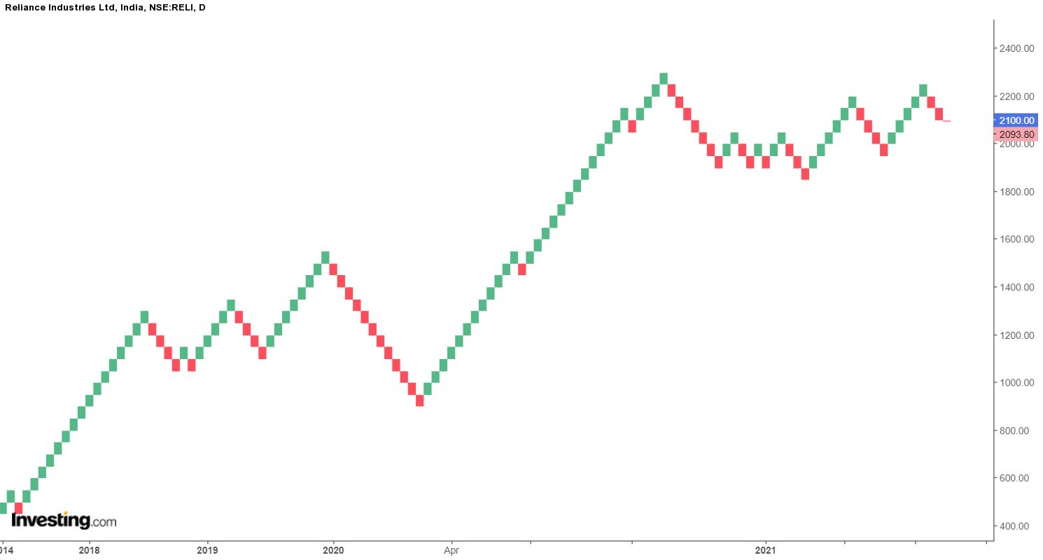
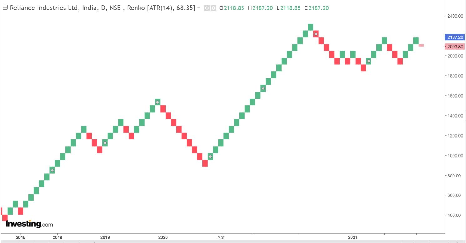
For example, If the brick value is set at 50 points, then a move of 50 points is required to draw another brick as shown in the below chart of Reliance India Ltd.
Price movements less than 50 points would be ignored and another brick will not be formed in the Renko chart.
Types of Renko charts
There are usually two types of Renko charts that depend on the calculation used. These are high/low charts and open/close charts.
1. High/Low Renko Chart
This type of Renko chart considers the behaviour of each price action. It consists of price actions between the highest and lowest price on the chart.
2. Open/Close Renko Charts
This Renko style takes only those price moves that are found within the Open/Close range of the price action.
How to determine the box value?
Traders can use the “box” settings to set the brick size, which can be a specific value or the Average True Range (ATR).
A specific point value means the brick size will remain constant even when new data is added to the chart.
The above chart of Reliance India Ltd., as shown above, has a fixed value, and each brick represents fifty points.
On the other hand, ATR values result in the fluctuating of the brick sizes. The default ATR is of 14 periods and it fluctuates over time as shown below:
Trading using Renko Charts
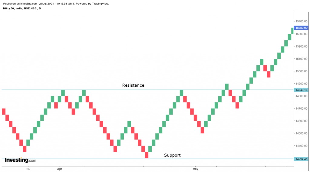
Traders can use troughs to mark support levels and peaks to mark resistance levels. They can also look for a two-brick reversal that signals a trend change.
Green bricks are formed when prices rise a certain amount and red bricks form when prices decline a certain amount.
The chart below shows a daily Nifty 50 chart and a 10-period simple moving average.
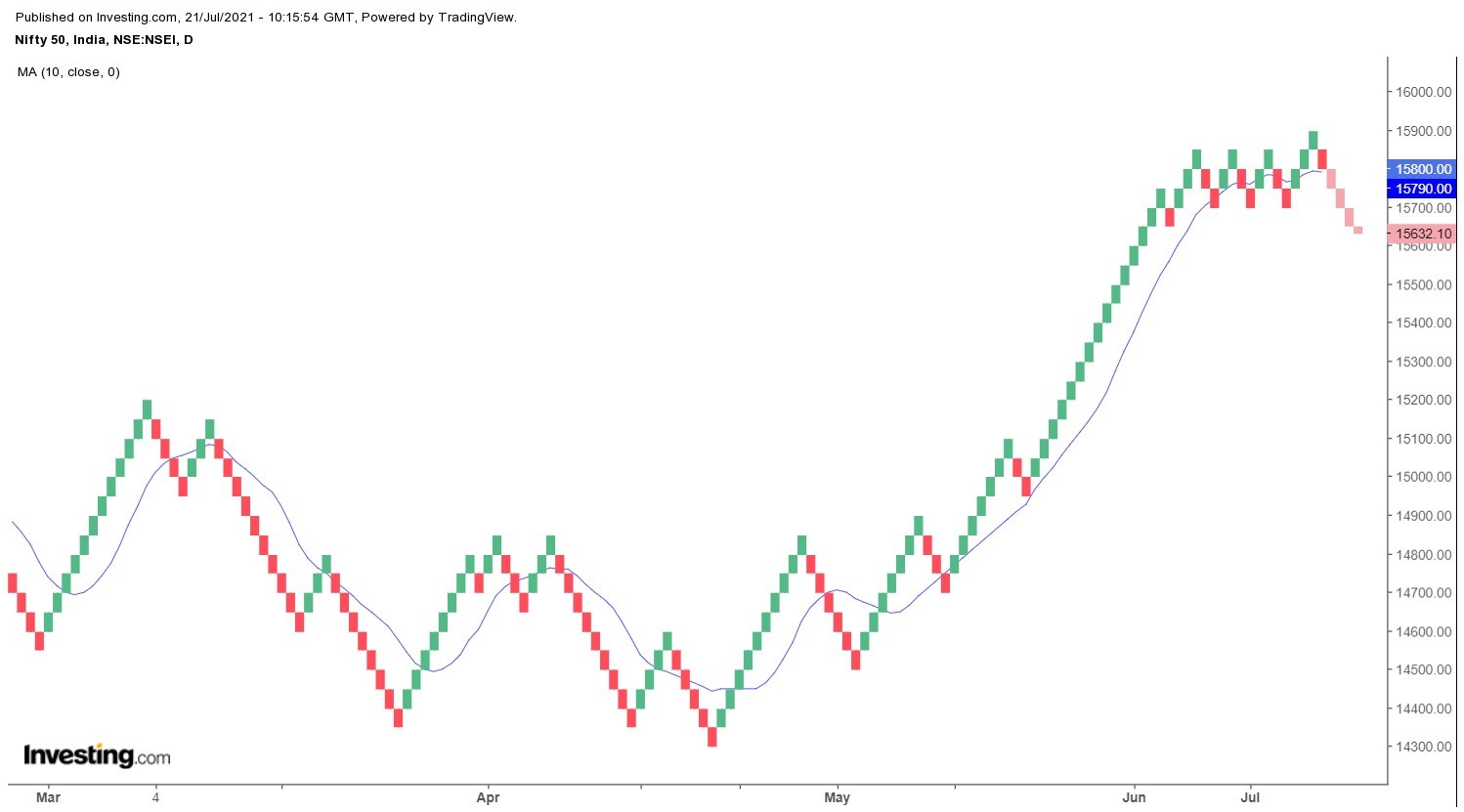
One should remember that an indicator on a Renko chart depends on the Renko values and will differ from the same indicator on a bar chart.
Traders should use shorter moving averages on Renko charts as smaller price movements have already been filtered out.
Advantages of using the Renko chart
Renko charts do not include the time aspect and thus filter out noises and small price movements on the charts.
Decreasing or increasing the size of the box will affect how smooth the chart will be. Lowering the size of the box will make more swings, but will also show possible price reversals quicker. Big box size will lower the number of swings and noise but will be slower to show a reversal price.
Limitations of Renko charts
Renko charts do not show in detail the price movements as bar or candlestick charts because they do not track time
Thus, this fails to tell the traders what has occurred during that period.
You can also do our Masterclass on Renko Chart Patterns
Difference between Renko Charts and Candlestick Charts:
The main difference between the Renko chart and the candlestick chart is that Renko charts are smoother than the candlestick charts. The same also holds for an OHLC (open, high, low, close) bar chart.
This is the reason that when we compare a Renko chart and a candlestick chart, the price movements on the candlestick chart will change directions more often.
Another difference between the two types of charts is that a Renko chart doesn’t always give us the most current information. As the Renko chart updates only when a new brick is formed and the candlestick chart always shows the last price.

Bottomline
Renko charts are mainly used by traders because they filter the noise by focusing on the specific amount of price changes. As with Point and Figure charts, it is easy for spotting highs and lows, and identifying key support and resistance levels, the same goes for Renko charts. Traders can easily identify uptrends or downtrends using these Charts. Like other charting techniques, traders can also use other technical analysis tools for confirming the price movements on Renko charts.
Frequently Asked Questions
What is the Purpose of Renko Charts?
Renko charts are primarily used to highlight trends and filter out market noise. They help traders spot and validate patterns, which makes it easier to make decisions based on price changes rather than time.
How are Renko Chart Bricks Calculated?
Renko bricks are sized according to a predetermined price movement called the “brick size” or “box size.” A new brick is added to the chart if the price moves by more than this predetermined amount.
Traders who are unable to devote much time in analyzing charts of various securities may benefit from scan section in StockEdge mobile app.
Happy Investing!

Excellent
Hi,
We really appreciated that you liked our blog.
Keep Reading!!